Colonial Behavioral Health Website Redesign
UX/UI Design | Website

Project Overview
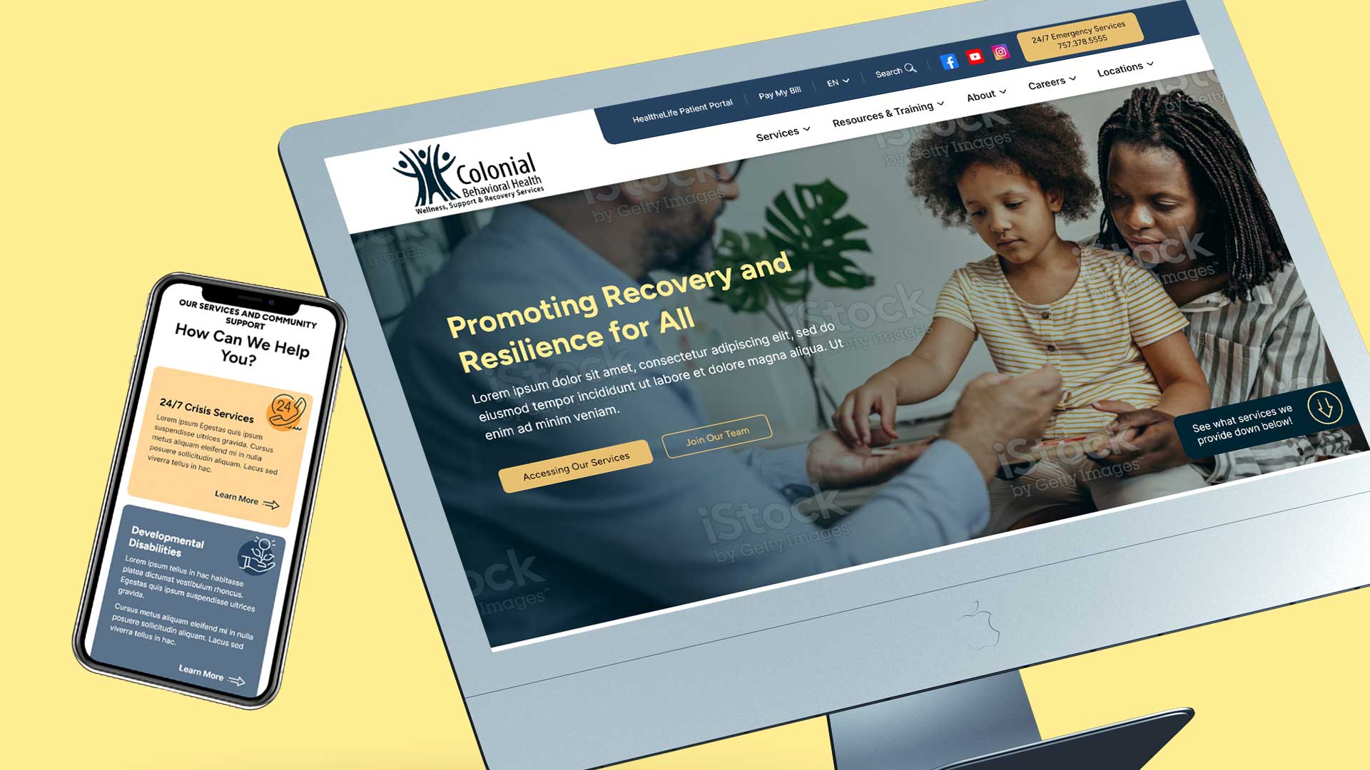
Colonial Behavioral Health (CBH) is an agency that provides mental health, developmental disability, and substance use disorder services to individuals and families in several counties in Virginia. Their website was extremely visually outdated and organized in a way that did not provide a lot of value to individuals needing to find information on their site. Much of their content was also embedded as PDFs instead of available directly on the webpages, making it even more difficult for their users to find. In addition to a lack of easy navigation, their website was not mobile friendly or ADA compliant and lacked some of the features that they needed in order to share important information.
My tasks for this project involved:
- Reviewing the stakeholder questionnaire and leading a kickoff meeting to go over the stakeholders’ responses and get a better understanding of what they were looking for in their updated website
- Creating user personas and user journeys
- Performing a content and site map audit
- Restructuring the site’s information architecture based on findings from the content and site map audits and user journeys
- Determining new styles such as fonts and color palettes to update and modernize the client’s branding
- Creating desktop and mobile wireframes and high-fidelity mockups for 10 unique pages
- Reviewing the website in the development environment to check for design accuracy, cross-browser compatibility, and device responsiveness
Client
Colonial Behavioral Health
Tools Used
Adobe XD
ChatGPT
UXPressia
XMind
Designs
Part I: Understanding the Audience
In order to understand how users might be struggling to use the CBH site, I had to better understand their wants and needs, which required getting a clear idea of who exactly the audience for this website was. Utilizing AI as a UX research assistant, I created 2 user personas that showcased users from opposing backgrounds who would be searching for help with different problems.
With a good understanding of the different users, I was then able to map out a typical user journey for a general user looking for services, from awareness to research to engagement to service. For each of these steps in the process, I delved into what goals the user would have, what their touchpoints would be while searching for and interacting with CBH, what their process would be to complete each stage, and what problems and pain points they may come across. Recognizing the issues that users could be having, I was also able to come up with ideas and opportunities for improvement both within the website and with general company processes.
Along with the general user journey, I also created a user journey for a job seeker. Besides a list of open positions, the CBH website had no information about what to expect if someone applied and/or worked at the agency, so creating this user journey was able to open up some good discussion on ways to improve a prospective employee’s experience on their website.
Part II: Getting Information Organized
Knowing the user goals and needs while using the CBH website, I next reviewed the different pages, how they were currently structured, and what content was on those pages.
The first thing I noticed was that the website was organized by an audience-based schema. While this choice of organization may have worked if the content on their site was truly separate for their different audiences, there were many pages that lived in both of their main 2 categories: Adult Services and Child & Adolescent Services. On top of that, despite those pages containing practically the same content in each category, they actually did have separate pages for each section, which meant that the website housed a lot of duplicate content.
The audience-based schema also caused some content to be hidden from users who would benefit from that information yet would not think to look under that category. For example, their trainings were open to people of many different ages, but it was buried within a tabbed module within a section of their site titled “Prevention” that lived under the main Child & Adolescent Services section.
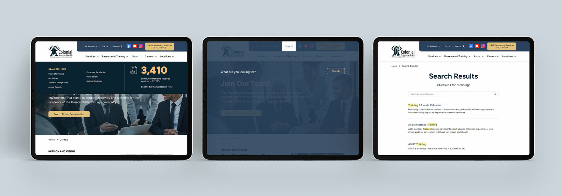
Recognizing that the site’s organization was not at all intuitive for users, I opted to reorganize the site by topic, making it much easier to understand what types of information users could find on the site and to navigate through it quickly and easily. Within the larger sections of the website – mainly the new Services section – I separated the pages even further into categories to help users easily refine their search in the navigation.
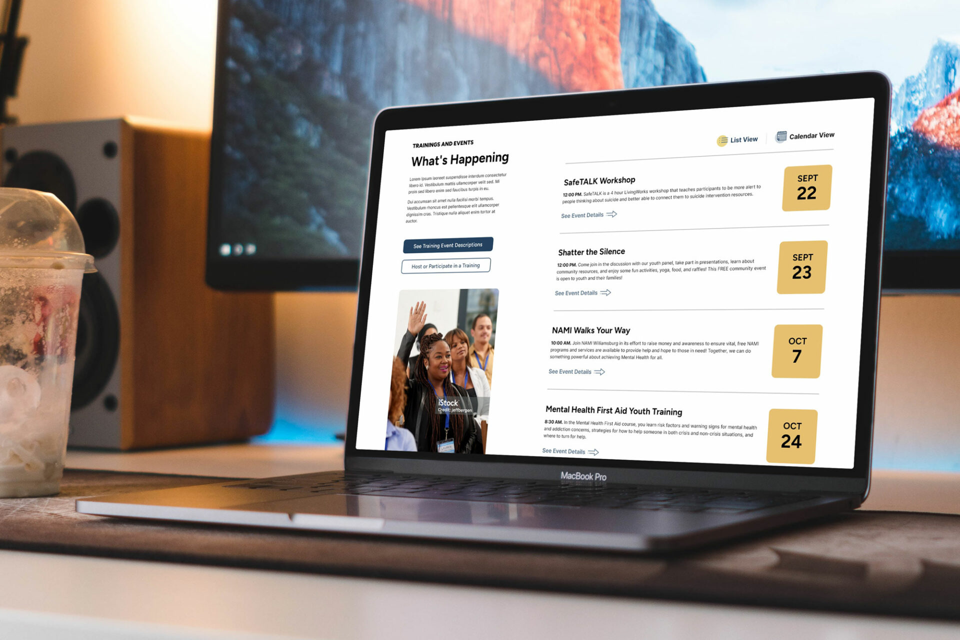
During this process, I was also able to suggest adding pages that would be beneficial to their users, such as a careers page, and added in pages that they felt were missing but needed, such as a training and events calendar.
Part III: Creating the Visuals
CBH had some branding, such as their logo, colors, and fonts, but these elements felt bland and outdated. Since their color palette consisted of a variety of similar blues and grays, I suggested that we add a new color to their palette to help elements on their website stand out and add some nice contrast. As for their font, they were using Calibri for their internal branded items and initially wanted to use that on their website as well. However, due to it being generic, overused, and not nicely compatible outside of the Microsoft suite, I was able to convince them to use a new font pairing for their site that was modern and easily readable but also added some personality to their brand.
With the styles of the website fleshed out, it was time to start creating wireframes, starting with the homepage. Choosing to create high-fidelity wireframes, my initial vision was to utilize large font sizes and elements, laying out overlapping elements to create movement and achieve a modern look to the page. Upon review, the client was not a fan of this approach; they wanted to see things smaller and more aligned, so I took their feedback and created a second version of the homepage wireframes, scaling everything back and following a more grid-based layout.
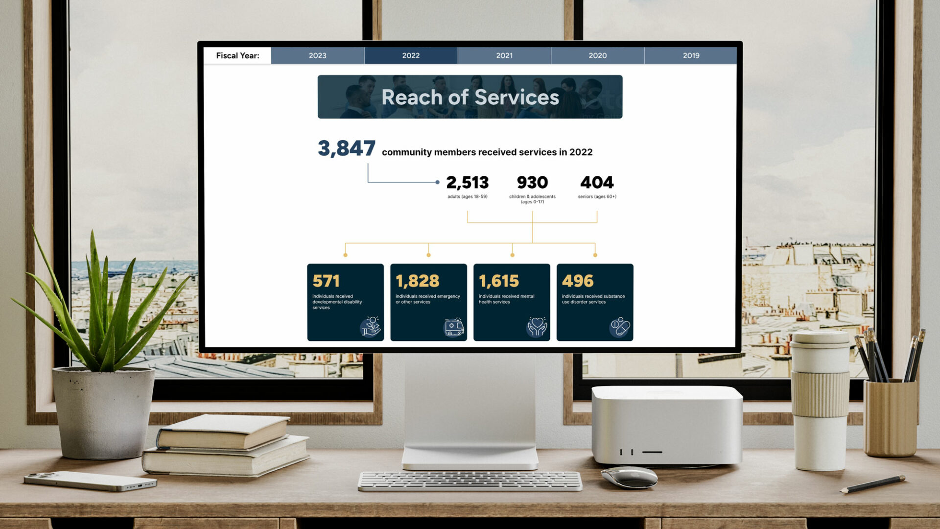
As wireframes were approved, I was able to start working on the fully fleshed-out designs, which was a fun challenge for this site. Some of the pages I designed did not currently exist on their website and required brainstorming the content, modules, and layout from the ground up. Other pages did exist, but a lot of the content was plain text housed within tabs. I had to figure out how to display information in a way that made it both visually appealing and easy to navigate and comprehend.
Another challenge was being able to give the client stylistic choices while ensuring that the website would still have a clean and consistent look and feel. Part of my task when coming up with new designs for the website was to design reusable components that the client could use to display various types of content on their subpages. Throughout the design reviews, the client asked quite often if they could have more options – mainly with color choices – to select from for different modules. While I did give them more options on some of the modules, I pushed to limit their options, explaining that keeping modules as consistent as possible in how they looked and were used would not only help with visual consistency across the site, but would also help users recognize meaning and functionality as they encountered these modules on various pages. I also had to ensure that multiple colors being used within modules would not compromise ADA compliance, which was very important to the agency.
By the end of the design phase, we had gone through numerous design changes, but by working closely with the CBH team, I was able to deliver designs that successfully solved the issues they had been having with their old site and modernized their site and their brand.
Part IV: Development and QA
During the development phase, I worked closely with the developers to make sure they understood the desired functionality for the different modules and that the modules were developed correctly to match the specifications laid out in the design document. I also reviewed the different pages to make sure that they worked as expected in all browsers and that they were all responsive for different screen sizes and devices. Once the pages were free of bugs, I then assigned it to another team member to check for ADA compliance.
Project Reflections
While this project was successful on the design front, it was probably one of the most difficult to navigate in terms of design processes and design handoff processes.
Throughout the project, I had to advocate for the importance of design tasks and UX decisions I had made both internally with my team and externally to the client. My goal for every project is to deliver the best possible solution for the client, and oftentimes that requires being able to explain the importance of and reasoning behind UX and design choices that I make. While I have had to explain and sometimes defend design decisions to clients many times on other projects, this project was one of the first where I had to do the same for my internal team in order to reach that goal.
Something that I discovered was that there were some important steps missing in our post-design processes, such as including the team member responsible for migrating content on design handoff meetings so they could correctly utilize the modules designed for the project during that phase. Also, while there was a design to development handoff where I would verbally and visually explain design functionality and requirements to the developers, there was no documentation to clearly explain those design choices or any limitations to the functionality. This lack of documentation allowed room for assumptions and mistakes to be made that could have better been avoided and saved time that needed to be spent on reworking or fixing modules.
These challenges and realizations opened the door for discussion to help improve and solidify our internal processes, which will help the team provide continuously better services and products going forward.


