Curbside Laundries Client Website Template Redesign
UX/UI Design | Website | Template
Project Overview
Curbside Laundries is a laundromat point-of-sale (POS) software solution that allows laundromat owners to streamline their wash and fold pickup and delivery services. Crafted by Super Suds Laundromat owners and brothers Matt and Aaron Simmons, this software system has improved the performance and success of many other laundromat owners who have decided to utilize the same software. In addition to their in-store laundromat POS system and pickup and delivery management, Curbside provides their clients with a template website that helps attract new customers and give their clients’ laundromats an online presence.
The website template solution that Curbside Laundries was providing for their clients was becoming old and outdated. On top of that, some of their clients felt that the template made all the websites look the same. The only real customization that clients could do to the website styling was to change the color palette and select from one of 2 font combinations. Matt and Aaron felt that it was time to revamp and modernize their website template solution for both their own laundromat website and their clients’.
Part I: Template Redesign
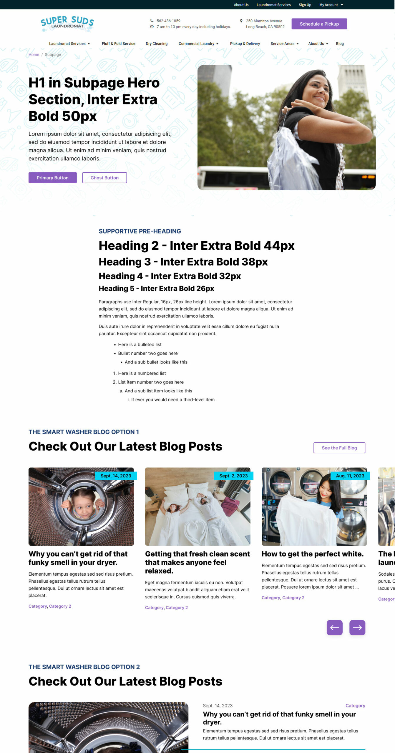
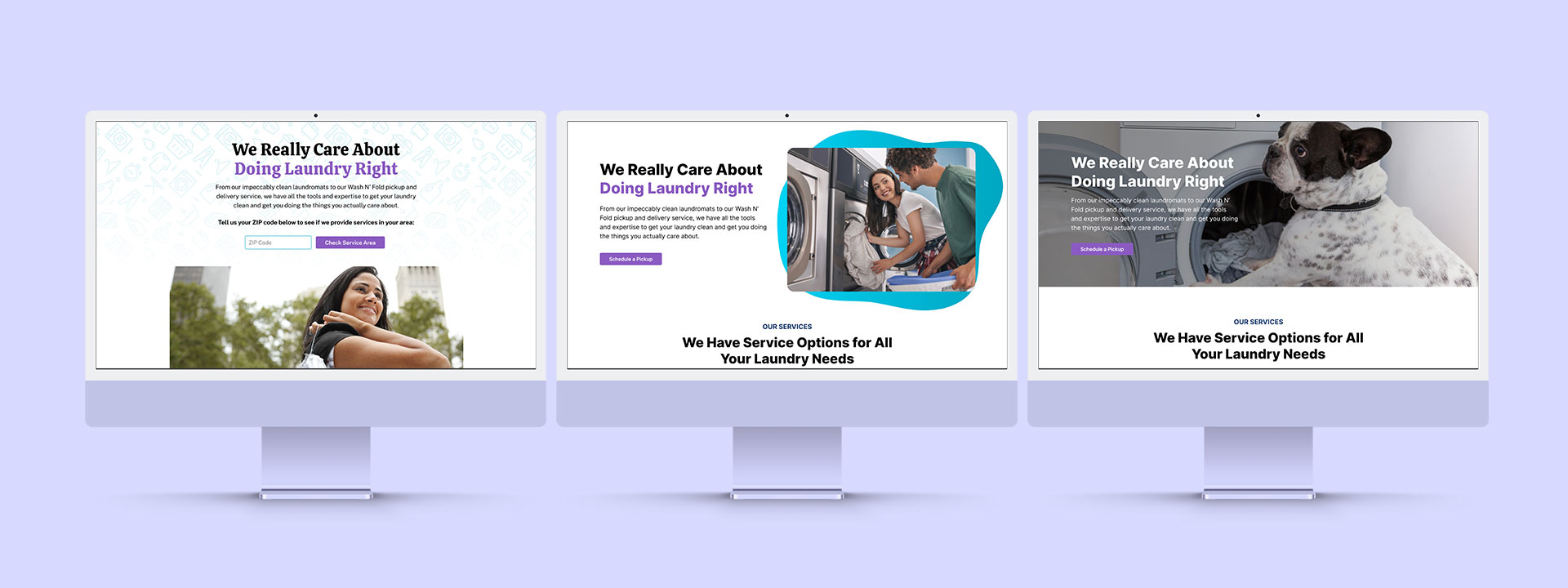
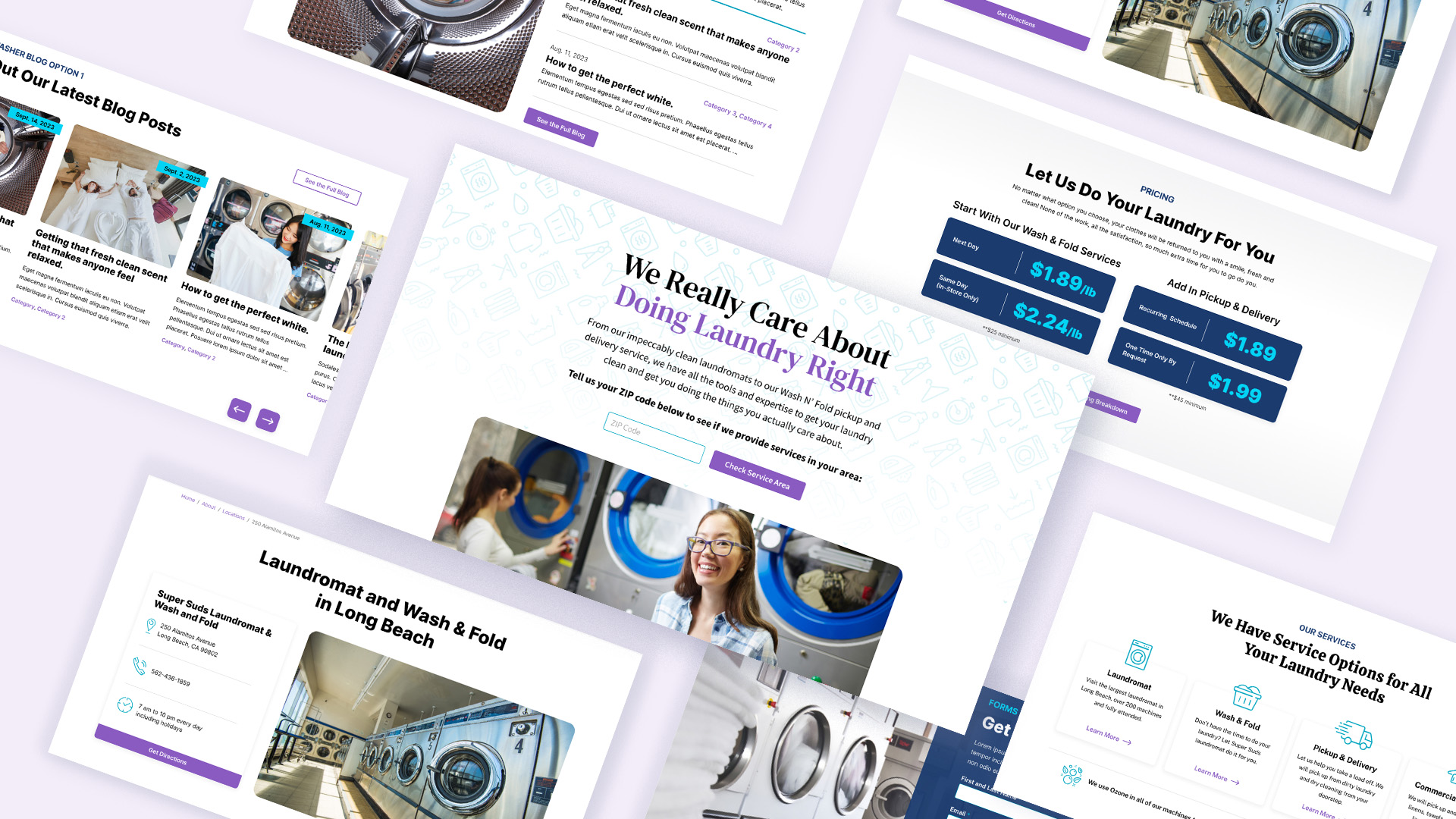
With only minimal design inspiration to go off of from the client to help shape the new designs, my first task for the website template redesign was to create a new initial design for the Super Suds Laundromat website homepage to make sure I was on the right track with the new style ideas for the website. At our first design review meeting, Matt and Aaron were thrilled with the new, modern look and feel provided by my initial homepage mockups.
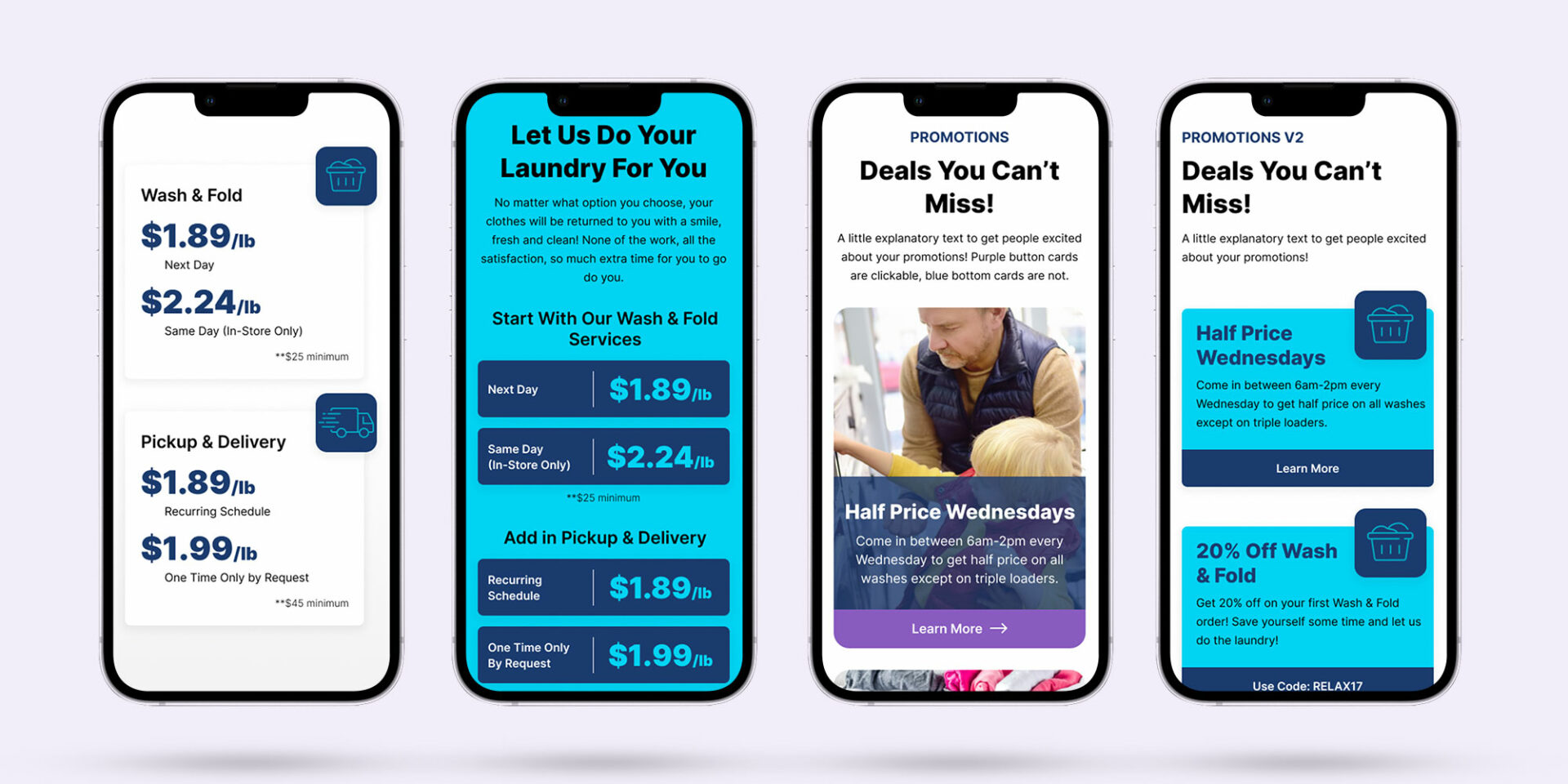
Knowing that I was on the right track, it was time to dig into the real challenge of this project: creating diverse design options for the website templates while also ensuring that no matter which options their clients chose, the sites would always have a consistent look and feel. The designs also had to map out where colors from a predetermined color palette would be used so that each client could have their own color branding incorporated in their sites. Here is what I determined and designed in order to provide a broad range of diversity while also staying consistent with what modules currently existed on their template site:
- 3 new, more modern font variations to choose from
- 3 diverse hero variations
- 2 different button styles
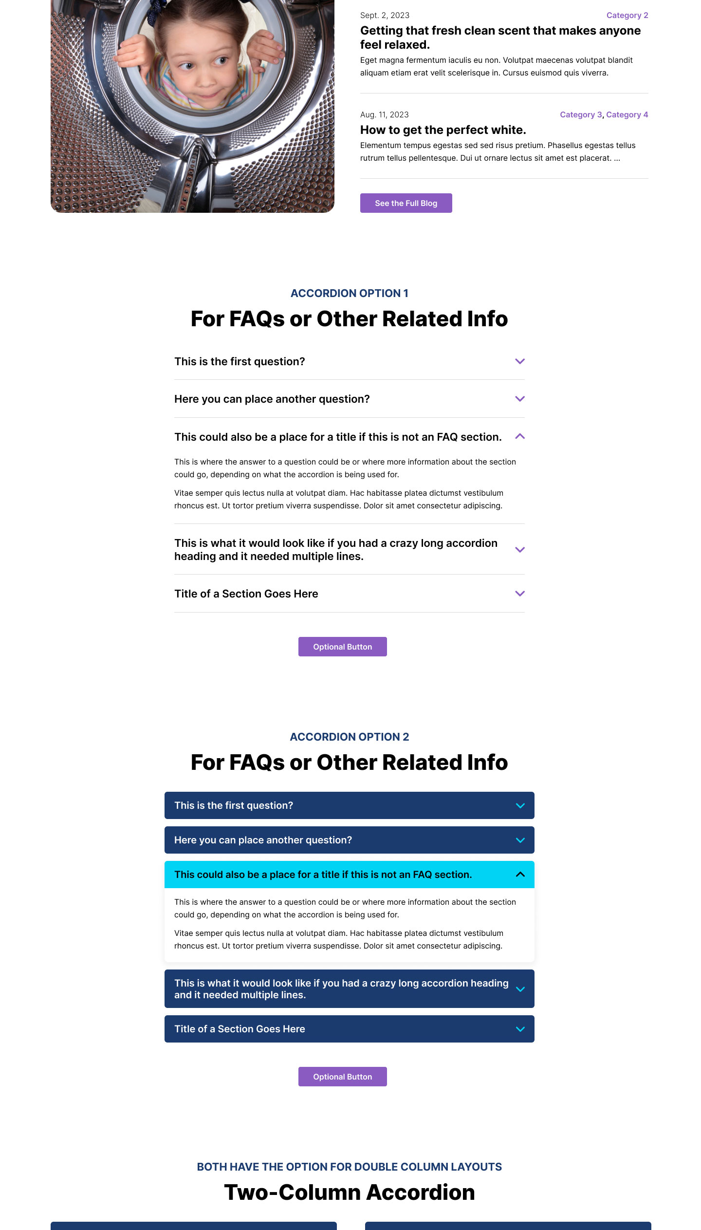
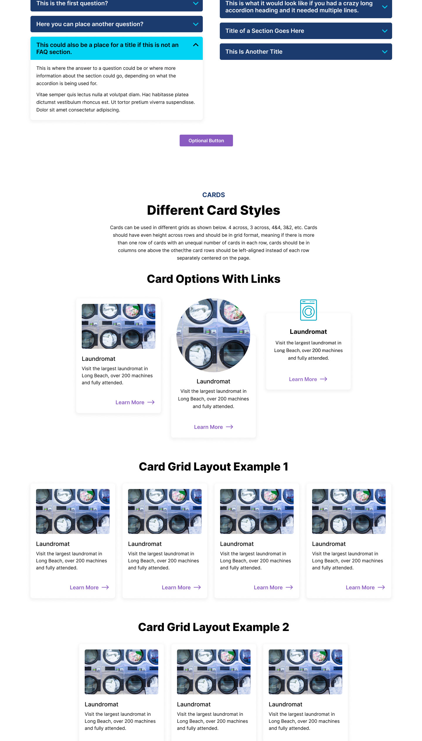
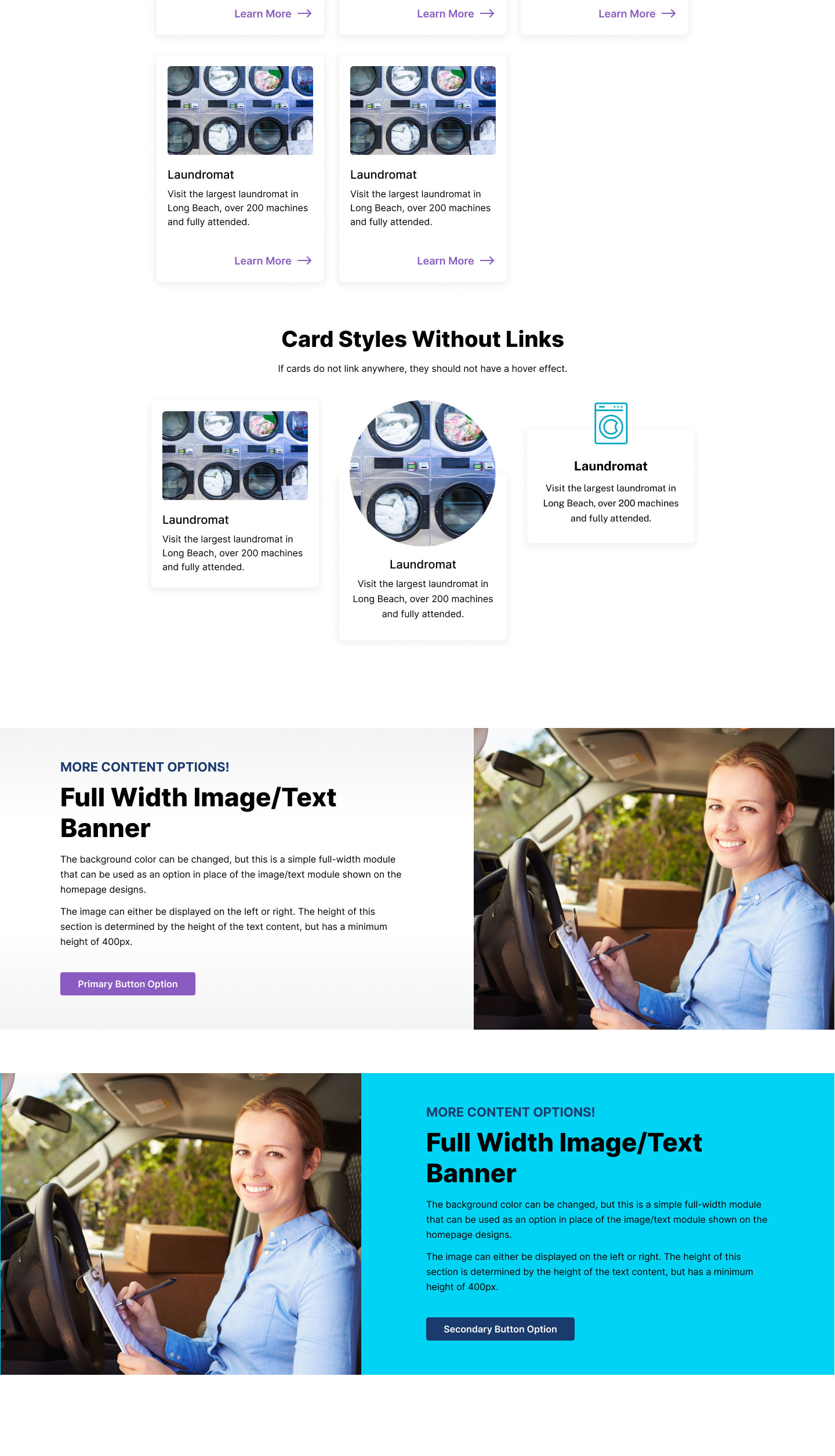
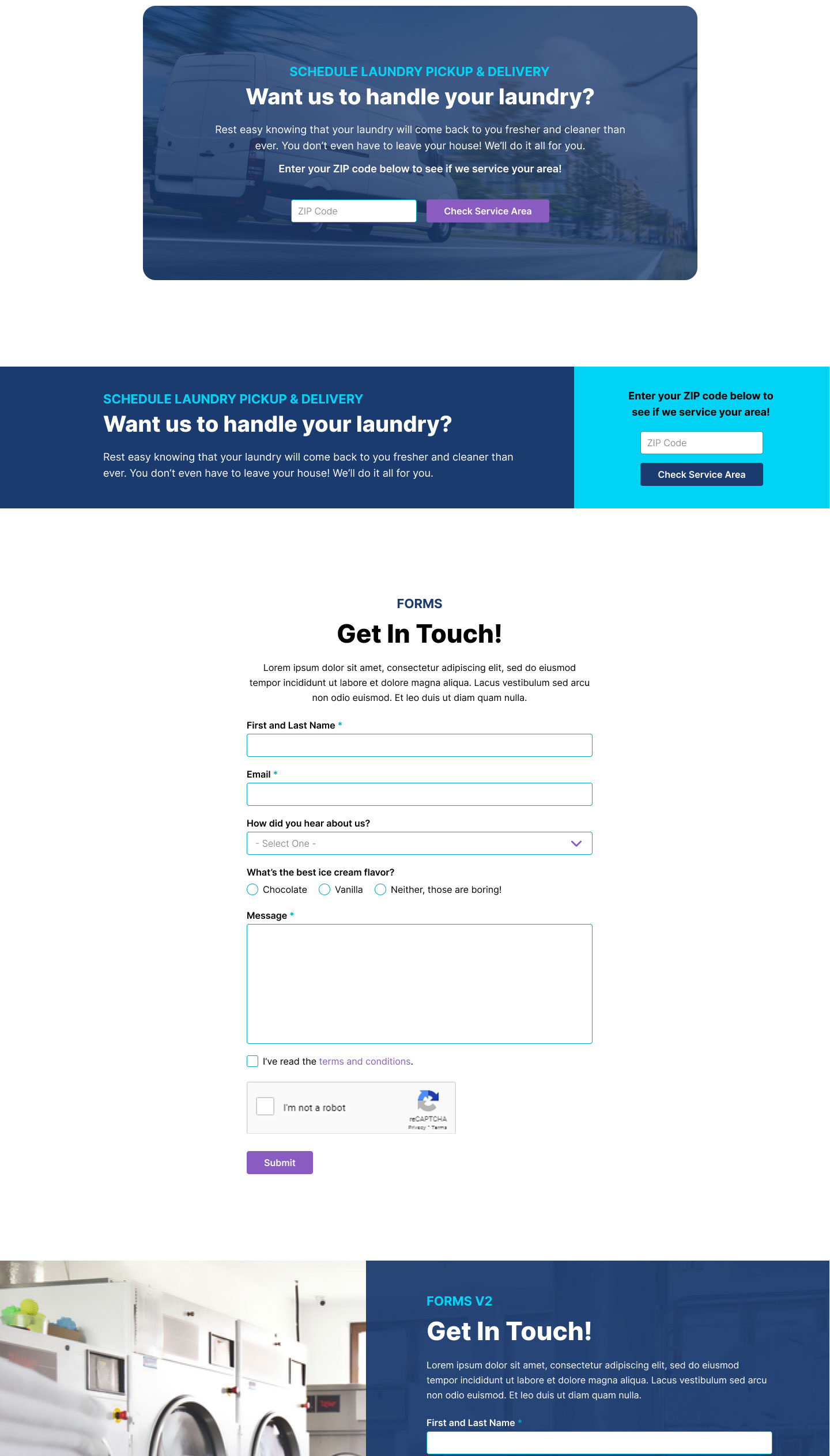
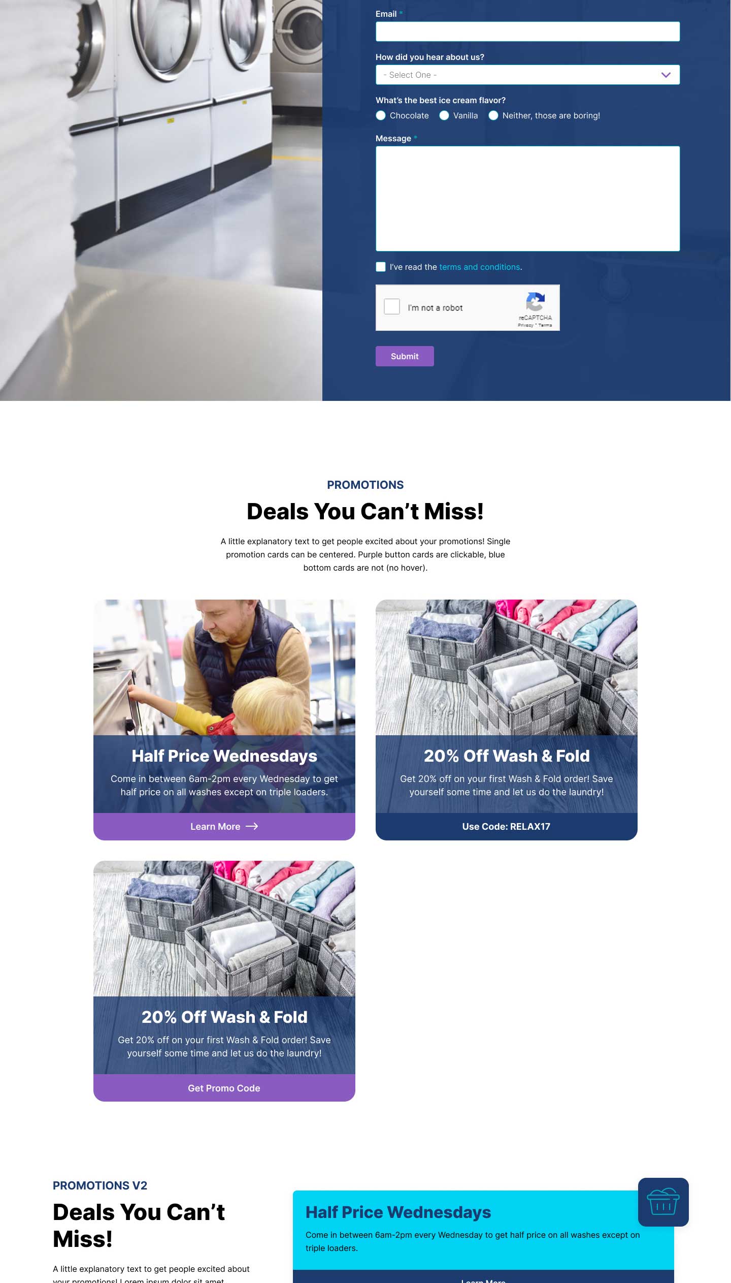
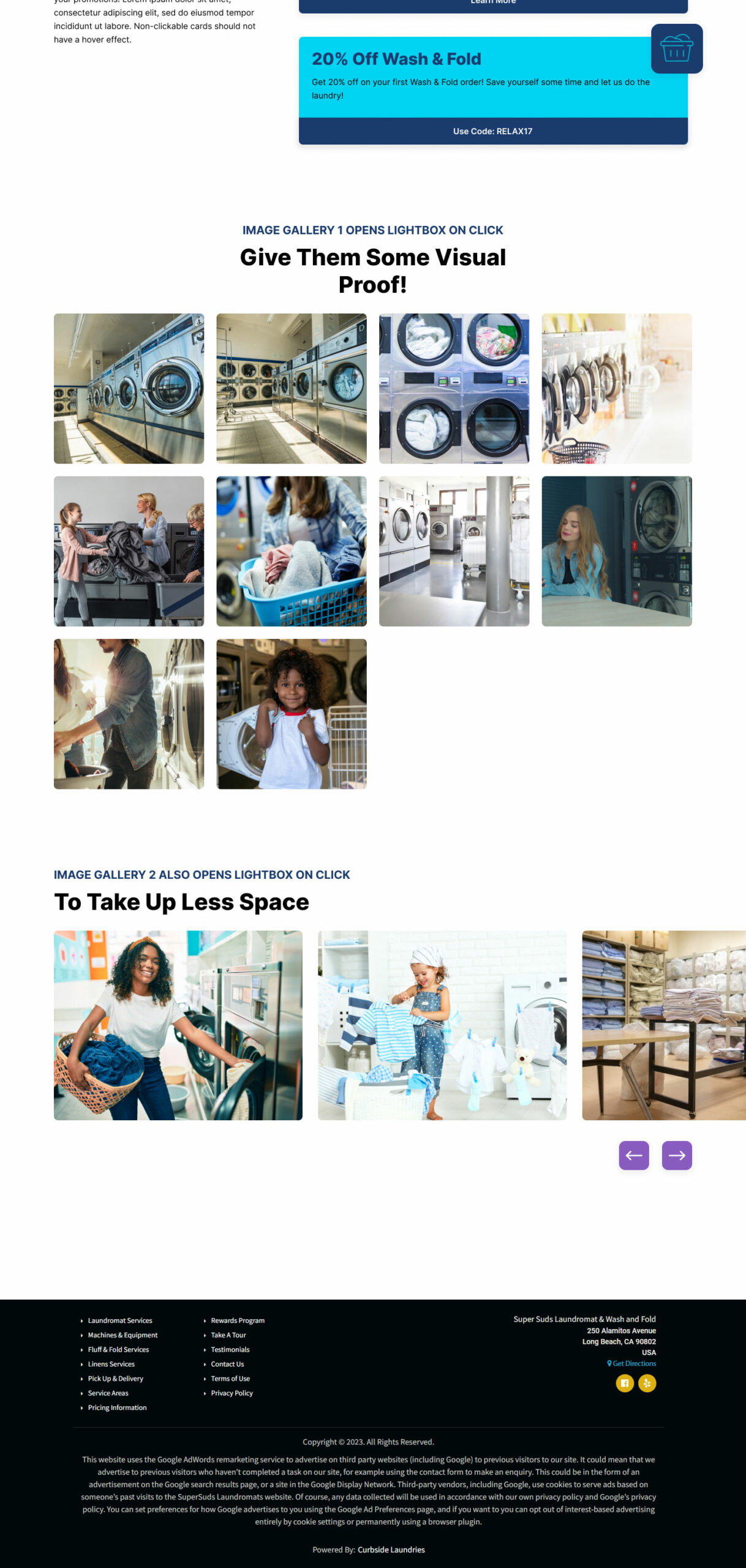
- 2 separate variations of the different modules I had designed for the homepage and all the different module types available within the current website template
- 2 different layout templates for existing page types, including locations index, location details, blog, service area index, service area details, and PPC landing pages for commercial and residential audiences
While some of the module styles could vary by page, many of them were meant to be selected as part of the website theme during initial setup, creating stylistic consistency across the different website pages. The goal was to make these templates as foolproof as possible for customers who had little to no web design experience.
The page templates (pages that would be pre-populated with select modules) utilized the modules that had already been designed along with any specialized components needed for that particular page. My aim was to give their clients an easy starting point for their common page types; we would pre-populate the pages with the sections we suggest they use and, if necessary, they would be able to add and remove modules from the pages in order to meet their specific needs. Rather than having to build out these common page types from scratch again and again, they were ready to go with a content formula that we know works.
Part II: Refinement and Quality Assurance (QA) Testing
Designing the website templates and all the different variations was a challenging task, but even more intensive was my task during and after the development phase: QA and ADA testing. This included making sure that the following requirements were met:
- The designs were accurate
- The modules functioned as expected
- Everything looked and functioned correctly across different browsers
- The modules translated correctly across different screen sizes and devices
- The website passed ADA standards based off of the WAVE tool
- The website functioned as expected when using the keyboard to navigate and when using a screen reader
Testing these designs in the development environment took a lot more work than your average website testing. The developers created multiple nodes of the website to showcase all the different possible page and module variations. On top of reviewing the different module variations within each of the nodes, I had to review the font variations to make sure they were being used and displayed correctly, especially since the all the fonts pairings required different font weight and font size usage.
During the development and testing phases, we had to figure out how exactly the Curbside clients were going to be interacting with and using the available modules and page templates from the Umbraco backoffice as they put their sites together and added their content. Since developing such a complicated website template with so many options and variations was not a cut and dry solution, that meant that the options the clients could view would not always be straightforward either.
For example, the card module style has to be chosen as part of the overarching site theme when spinning up a website. Depending on which style was chosen, the cards would need an image or an icon. Since the fields in the backoffice could not change based on which theme was chosen, there would be a field available for both an image and an icon. However, if the selected theme was an icon-style card, an image would not render on the front end even if it was uploaded in the backoffice and vice versa. In order to help navigate confusing discrepancies such as this, clarify other items that may not be obvious, and help make good design and UX decisions, the developers and I added descriptive text in the backoffice as necessary, similar to creating tool tips for content on the front end of a website.
The Outcome
With so many available options and modern styles to choose from, Curbside clients can no longer say that they have cookie cutter websites that all look the same! The Curbside Laundries business is staying true to providing top-notch, modern laundromat websites for their clients that continue to attract new customers, built on a platform that makes it possible to build and manage themselves.
