Marathon Consulting Icon Design
Iconography | Branding | Design
Project Overview
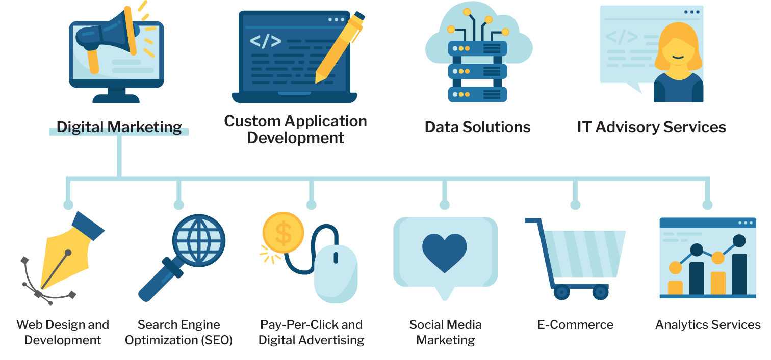
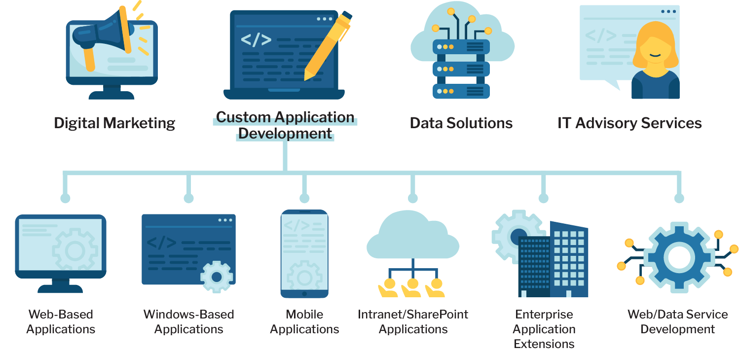
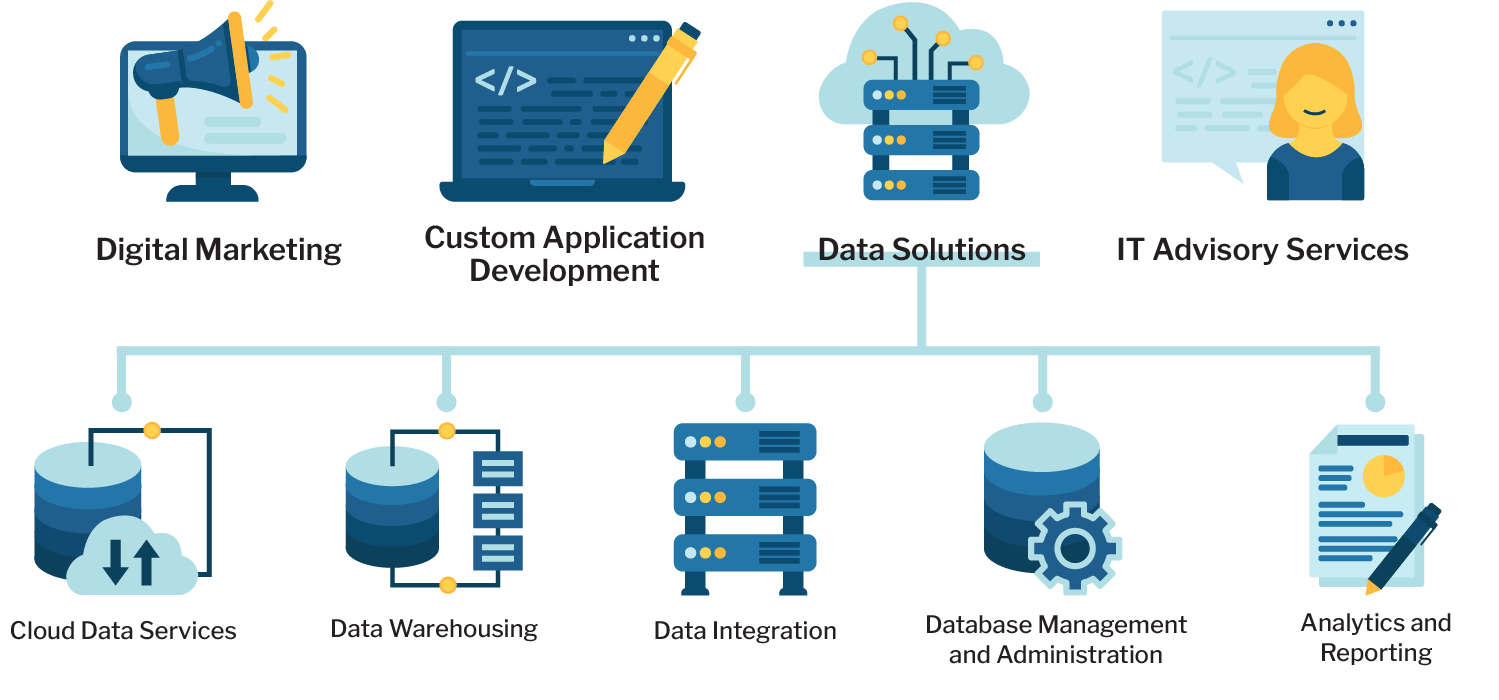
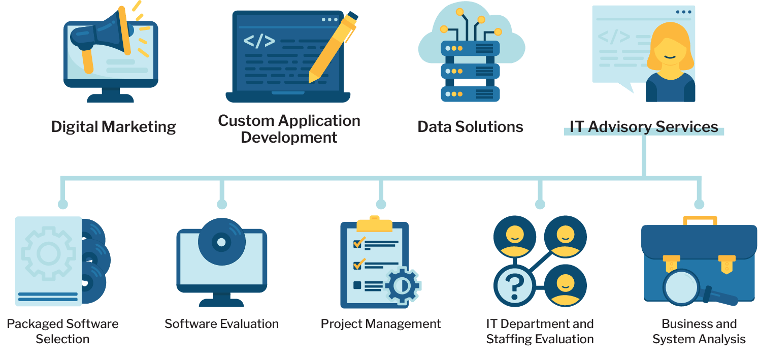
Marathon Consulting is an IT consulting company headquartered in Virginia Beach. Their website was utilizing icons to represent the different service areas they offer, but they were very generic and uninteresting for the size they are being displayed at. To shake things up and give a bit more personality to their site, I designed new icons in a more illustrative style to represent each of their services.
While this task started out as a simple project to create icons for their different services, it quickly turned into a means to start revitalizing the company's branding, starting with their color palette. What they had previously was a range of blues that didn't all quite mesh well together, plus a dull red that not only looked out of place, but was being utilized on the site in the same capacity as the blues instead of as a secondary pop of color. Not wanting to incorporate the red, but needing a pop of color to create contrasting elements and details in the icons, I selected a yellow and a similar gold. Those along with some variations of the original palette blues became the color scheme I used for the icons.
Client
Marathon Consulting
Tools Used
Adobe Illustrator
Continued Branding Success
Icon and branding development didn't stop there. With the service breakdown graphics so well received, I continued adding to the icon set.
First, I created icons to replace those being used on the website to represent company values and ideas. That website content was soon translated into new graphics for marketing materials such as project proposals and PowerPoint presentations, giving those items a much more modern, professional, and cohesive look and feel. From there, I continued to add to the icon set as needed to represent different ideas or create more graphics.
From website graphics to marketing slicks to info sheets to t-shirt designs to performance review presentations and more, the new icons are being used as an exciting experience across Marathon Consulting's branding identity and the updated color scheme is contributing to a brighter, more eye-catching and inviting look and feel.


