Old Dominion Athletic Foundation Website Redesign
UX/UI Design | Website

Project Overview
The Old Dominion Athletic Foundation (ODAF) was in need of a lift to their website, both in terms of the outdated look and feel and the usability and navigability for their donors and fans. On top of having a more modern website, some of their main goals included creating a cleaner, more intuitive form experience for purchasing parking; pushing for more donations by ensuring donation CTAs, donor spotlights, and donation information were front and center; and creating a better UI for their events.
This project involved:
- Stakeholder interviews
- Restructuring the website’s information architecture
- Creating wireframes for 10 unique pages for both desktop and mobile
- Creating a new, more intuitive experience for the ODAF’s football parking request form
- Creating high-fidelity mockups for 10 unique pages for both desktop and mobile, including a new mega menu
Client
Old Dominion Athletic Foundation
Tools Used
Adobe XD
Photoshop
Illustrator
Designs

Information Architecture
After speaking with the ODAF team to get a better understanding of what they felt was and was not working well on their site and what they were hoping to achieve from this redesign, the first step was to review the site’s information architecture. While they don’t have a large website and the information was grouped and labeled relatively well, there was still room for improvement.
Some pages contained very little information, so I combined them with other relevant pages within the same section of the website. I grouped other pages that were taking up real estate within the primary level of navigation under the label “Game Day” to help fans find the information they needed easily. Improving the site’s structure in this way allowed more space in the primary navigation to promote their primary call to action: donate!
Along with determining the site’s overall page structure, I also created a list of sections for the homepage that I felt would best support the ODAF’s goals to get users to take action or help guide them deeper into the site to find relevant information.


Wireframes
When the project scope was defined for this project, we determined which pages required unique designs that could not be created using a general subpage template. Before starting on high-fidelity designs, I created wireframes for each of the pages and their different variations. This way, I was able to get approval on the general layout and sections of each of the pages before diving into the fine details.
For this project, I opted to create high-fidelity wireframes, which gave a very realistic idea of how the pages would be created and what some of the functionality would be instead of simply creating a general idea of what goes where. Creating high-fidelity wireframes allowed me to get creative and play around with the structure and layout of the pages without having to worry yet about colors, images, font sizes and styles, or other styling details. It also made for a smooth and quick transition to creating the high-fidelity mockups.
You can review the wireframes I created here.

Parking Request Form
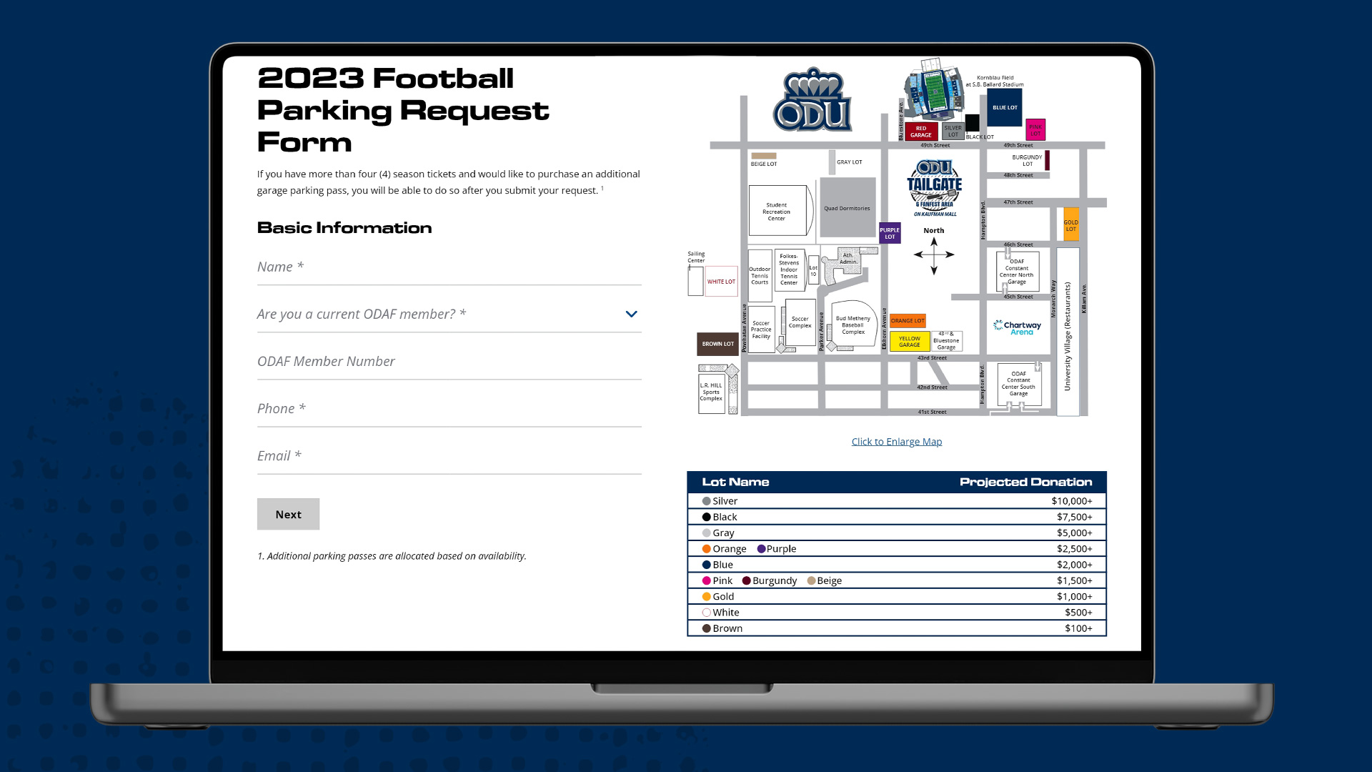
The ODAF's old parking page and parking request form were unorganized and not very intuitive. Information was not grouped together or ordered in a way that made sense to guide users on their journey to get information about parking and ultimately fill out the parking request form.
My first step to create a better user experience was to place all parking information on a single organized page. That included adding an interactable parking map to the page to review the parking options and pricing even before deciding whether or not to fill out the form. I also moved the CTA to fill out the parking request form to a more centered and relevant location so that it easily stood out. (The parking request form was also added to the main website navigation for easy access.)
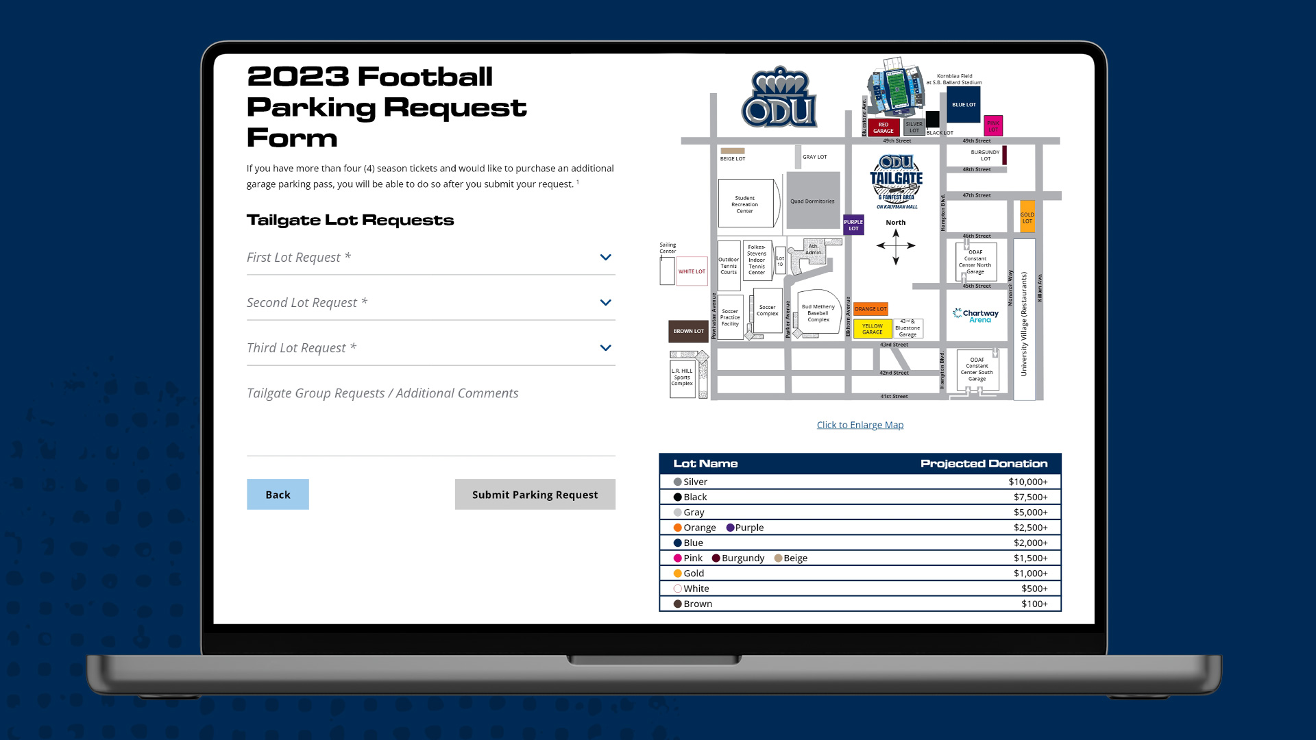
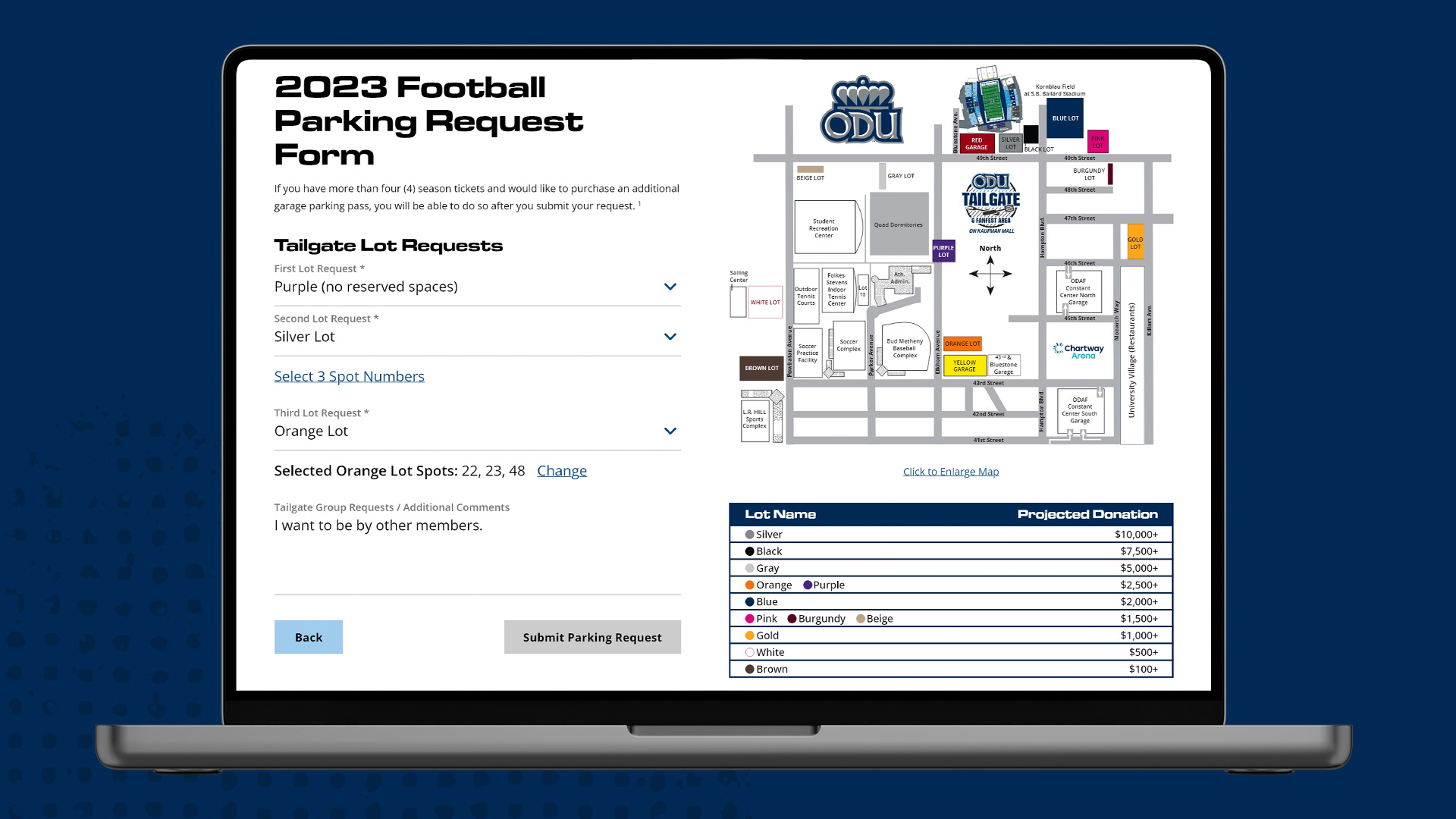
After working with the ODAF team to really understand how they needed the form to function and what fields they really needed or wanted to include, I first separated the form into 2 steps in order to reduce cognitive load for the user. Once they input their basic information, they are then directed to the second step, which is the more complicated parking spot selection.
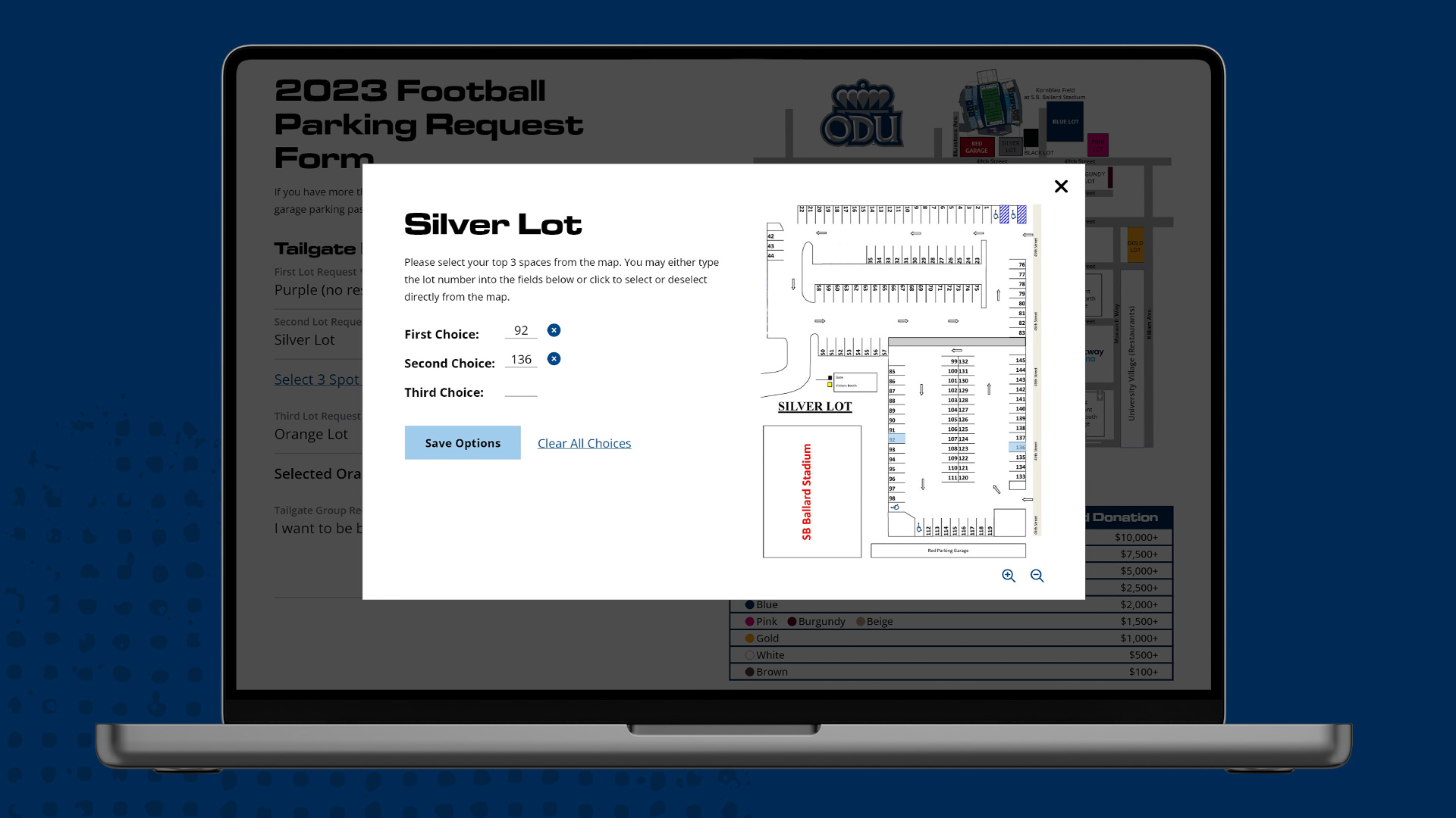
Users can first select what parking lot they want to request, which they can see the location of in the map. The form then utilizes conditional logic to add a step for the user to select specific parking spots based on whether or not the selected lot requires it. Parking spot selection was an even bigger UX challenge, but by creating multiple ways to select spots, providing options to remove a single or all spot selections, and making the parking lot map zoomable and user friendly on both desktop and mobile devices, I was able to achieve an easy and intuitive UX for a form with some complicated functionality.

Design Mockups
Taking the colors and fonts from the ODAF brand style guide and creating different textures and elements to use repetitively across the different pages, I created an updated identity and cohesiveness across the website.
In order to achieve a modern look, I opted to use large font sizes and elements and created overlap to emulate movement. I also utilized image cutouts of their athletes that I created in Photoshop to showcase action and really emphasize who and what the site was all about.
The pages were clean and easy to scan, navigate, use, and read, yet exciting and actionable, successfully achieving the goals and vision the ODAF team had for their website upgrade.

Thank you ... so so much for your hard work for the ODAF! We are very grateful and continue to get compliments on how good the site looks! Thank you!
Ashley Waters
Athletic Donor Relations Manager
Old Dominion Athletic Foundation